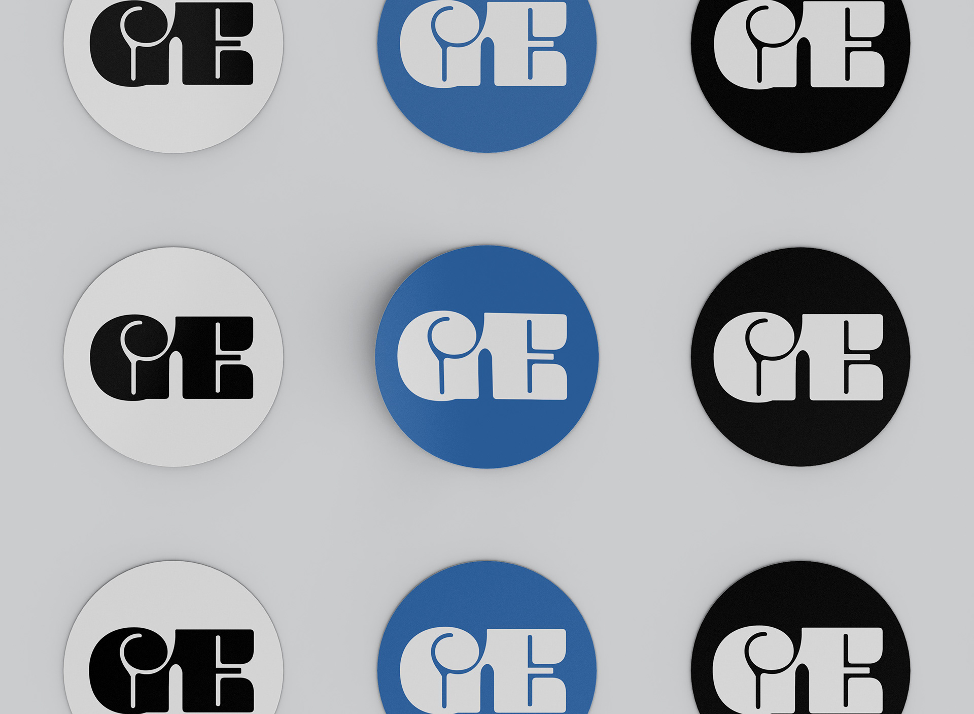
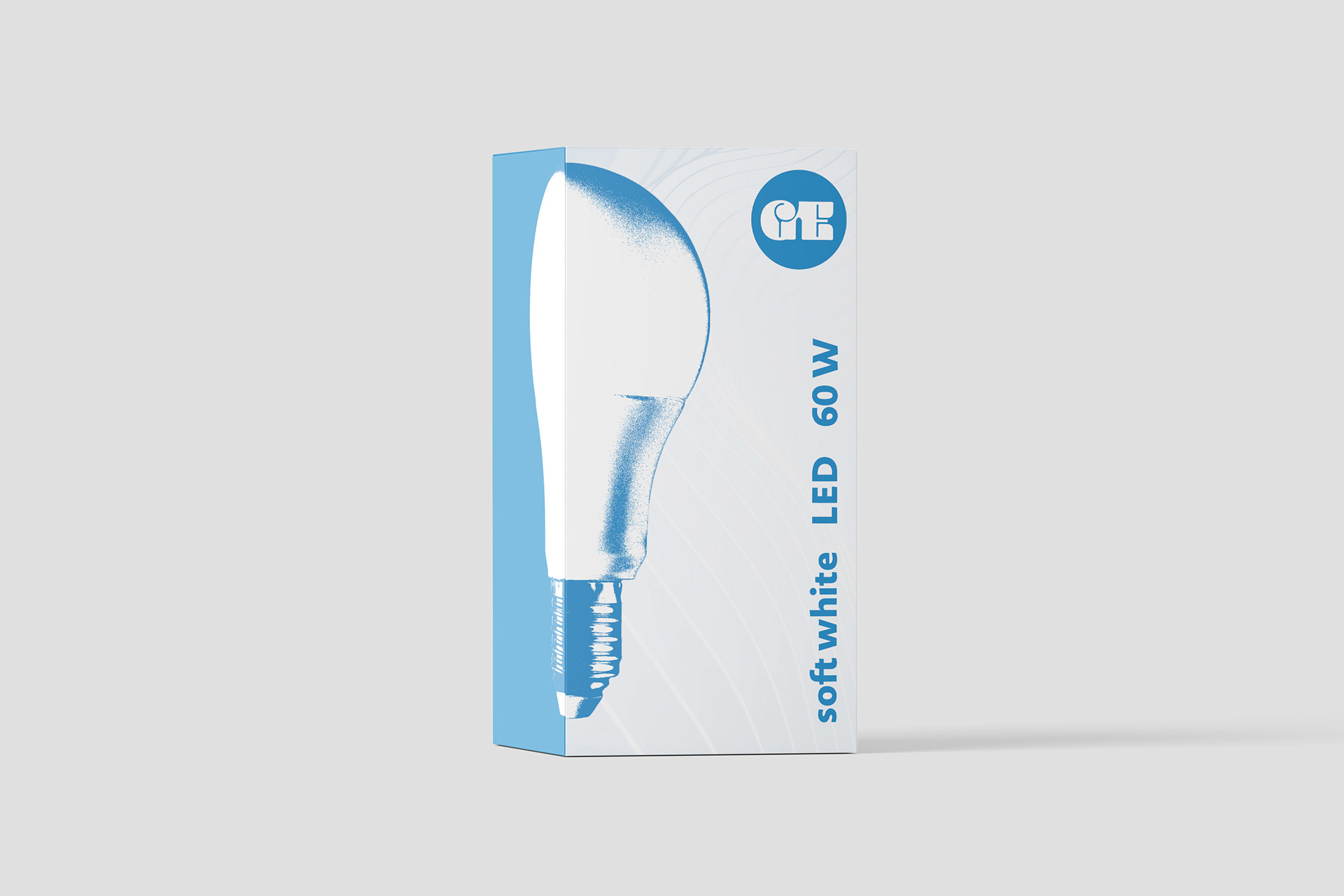
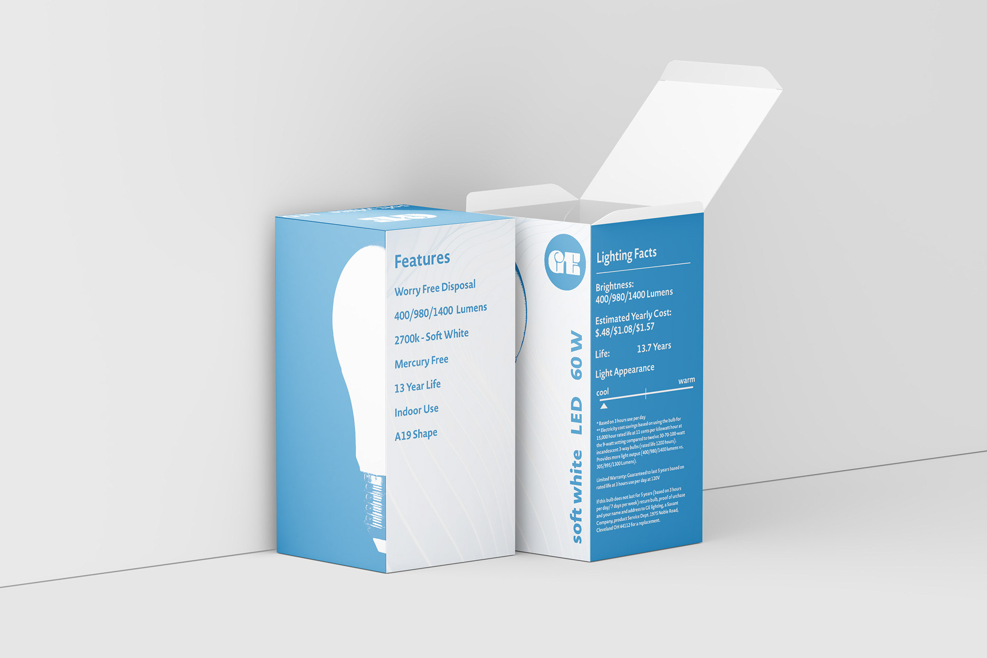
This is a redesign of packaging for a GE lightbulb. In the grocery store I saw the original packaging and it was brought to my attention that the packaging could use updating. When creating the new logo, I wanted it to echo the classic curved found in theĀ GE logo that we have seen throughout the years, but feel more modern and minimalistic.
![](https://cdn.myportfolio.com/d8fbd9d7-64f9-4e89-914b-fd832eb1ca52/c2f709f8-17e7-4bbb-b5a5-75c3e6df15fc_rw_1920.jpg?h=88696cbf5a3a5bc60d456ced2e082740)
![](https://cdn.myportfolio.com/d8fbd9d7-64f9-4e89-914b-fd832eb1ca52/7a96fdde-ac6d-4fc7-8a40-8956cdb739f4_rw_1920.jpg?h=39e4a9f88cd2a6225edca0453d2ee463)
![](https://cdn.myportfolio.com/d8fbd9d7-64f9-4e89-914b-fd832eb1ca52/3acd0ac4-1021-4b8c-96f7-16a18c99be20_rw_1920.jpeg?h=3aaa5409da4ef6280ec7c72921197972)